5 Product Label Design Tips to Elevate Your Packaging

Product Label Design Should Be Honest

Any designer might default to trying to depict a product in its most desirable and flawless state, but an experienced product label designer knows that it’s essential to honestly represent a product. Your design is supposed to tell your product’s story, not fabricate a misleading fable.
The imagery and messaging on your label should be, to the best of your ability, an accurate representation of what consumers will find inside of the packaging. This need for honesty is especially true when design food labels or any other products people will consume or use for their body. You know your product best, so make sure your design properly represents what you sell and how it should make customers feel.
If you still think this a little deception is fine, just consider what can happen. Even if your label gets someone to buy your product once, that individual will quickly snuff out that your packaging design wasn’t quite so honest about its contents. That one-and-done customer won’t be giving you any more money. What’s worse is that a slighted consumer may tell others that your product is misleading.
That scenario represents quite an unfortunate spiral thanks to a misleading packaging label design. That’s why we suggest being as transparent with your packaging design – and we’re talking about more than just clear labels. You make a good product, so make sure your packaging properly represents your work.
Product Label Design Must Take Legalities into Account
It’s okay to push boundaries with your design, but your label must follow any applicable federal or state regulations. Several products are regulated by various government entities, so there’s a good chance some organization will have a say in what you include in your design.
For example, the Alcoholic Beverage Labeling Act requires that alcoholic beverages carry a government warning, among other things, telling pregnant women of the effects of drinking, and regular consumers of the health risks. The penalties for violating this act can be a fine in the tens of thousands of dollars. As such, you’ll want you brush up on your Alcohol and Tobacco Tax and Trade Bureau (TTB) regulations to make sure your design is up to date with legal standards.
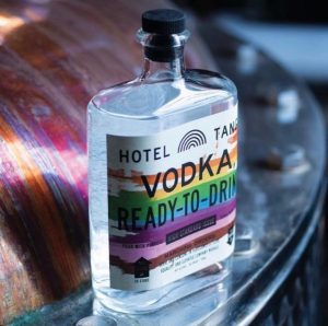
Beer is far from the only product that needs to incorporate legal guidelines into its packaging label design. Wine labels, spirit labels, food labels, health and beauty labels, and so many more all carry some sort of legal requirement to communicate ingredients, warnings, or risks with consumers.
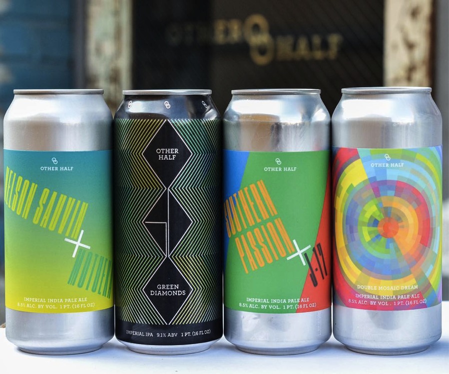
There’s always competition. Regardless of which product is being designed for, it must exist on a shelf, in an online store, or somewhere else with all of its rivals. That’s no small task while still staying true to the product, the brand, and labeling regulations. Still there are ways that your design can keep a unique quality that differentiates it from its shelf-neighbors.
Use different font types to evoke specific emotions and quickly portray your product and brand’s personality.
90 percent of information transmitted to the brain is visual, so incorporate imagery to your product label design can help it get noticed.
Utilize color psychology and contrasts to develop a striking color palette that evokes certain moods and feelings and competitively positions your product in a visual market.
Enhance your design in cool, creative ways with embossing, hot foil stamping, and other label decorations that turn your product into a visual spectacle.
Build in white space to embrace minimalism or space out certain aspects of your design to make them more legible.


There are 6 comments
You’re so cool! I do not think I have read something like that before.
So great to discover somebody with some original thoughts on this topic.
Seriously.. thanks for starting this up. This site
is something that is needed on the web, someone with some originality!
Stop by my site … followgram
Hey very nice blog!
Here is my web-site buy instagram likes weekly
Hello! I know this is somewhat off-topic however I had to ask.
Does building a well-established website like yours
take a massive amount work? I’m completely new
to writing a blog however I do write in my journal on a daily
basis. I’d like to start a blog so I can easily share my personal experience and feelings online.
Please let me know if you have any kind of recommendations or tips for
new aspiring bloggers. Thankyou!
My web site :: Twicsy
Good day! I could have sworn I’ve been to this website before but
after reading through some of the post I realized it’s new to me.
Anyhow, I’m definitely glad I found it and I’ll be bookmarking and checking back frequently!
Have a look at my web blog; follow liker instagram review n/a
Thanks for your blog, nice to read. Do not stop.